Relative Frequency and Percentage Distributions
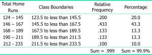
Relative frequency of a class = Frequency of that class / Sum of all frequencies = F/ Σf
Percentage = (Relative frequency). 100
Example 2-4
Calculate the relative frequencies and percentages for Table 2.10
Solution 2-4
Table 2.11 Relative Frequency and Percentage Distributions for Table 2.10
Graphing Grouped Data
Definition
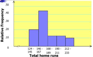
A histogram is a graph in which classes are marked on the horizontal axis and the frequencies, relative frequencies, or percentages are marked on the vertical axis. The frequencies, relative frequencies, or percentages are represented by the heights of the bars. In a histogram, the bars are drawn adjacent to each other.
Figure 2.3 Frequency histogram for Table 2.10.
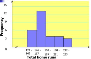
Figure 2.4 Relative frequency histogram for Table 2.10.
Graphing Grouped Data cont.
Definition
A graph formed by joining the midpoints of the tops of successive bars in a histogram with straight lines is called a polygon.
Figure 2.5 Frequency polygon for Table 2.10.
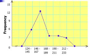
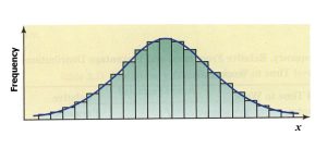
Figure 2.6 Frequency Distribution curve.
Example 2-5
The following data give the average travel time from home to work (in minutes) for 50 states. The data are based on a sample survey of 700,000 households conducted by the Census Bureau (USA TODAY, August 6, 2001).
Example 2-5
|
22.4 19.7 21.6 15.4 21.1 |
18.2 27.0 21.9 22.1 25.4 |
23.7 21.7 23.2 19.6 24.9 |
19.8 17.6 16.0 21.4 25.5 |
26.7 17.7 16.1 23.8 20.1 |
23.4 22.5 22.3 21.9 17.1 |
23.5 23.7 24.4 21.9 |
22.5 21.2 28.7 15.6 |
24.3 29.2 19.9 22.7 |
26.7 26.1 31.2 23.6 |
24.2 22.7 22.6 20.8 |
Construct a frequency distribution table. Calculate the relative frequencies and percentages for all classes.
Solution 2-5
Approximate width of each class = 31.2 – 15.4 / 6 = 2.64
|
Class Boundaries |
f |
Relative Frequency |
Percentage |
|
|
15 to less than 18 18 to less than 21 21 to less than 24 24 to less than 27 27 to less than 30 30 to less than 33 |
7 7 23 9 3 1 |
.14 .14 .46 .18 .06 .02 |
14 14 46 18 6 2 |
|
|
Σf = 50 |
Sum = 1.00 |
Sum = 100% |
||
Example 2-6
The administration in a large city wanted to know the distribution of vehicles owned by households in that city. A sample of 40 randomly selected households from this city produced the following data on the number of vehicles owned:
5 1 1 2 0 1 1 2 1 1
1 3 3 0 2 5 1 2 3 4
2 1 2 2 1 2 2 1 1 1
4 2 1 1 2 1 1 4 1 3
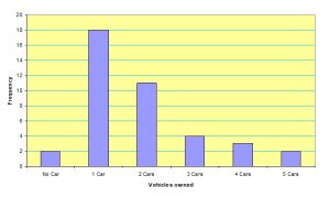
Construct a frequency distribution table for these data, and draw a bar graph.
Solution 2-6
Table 2.13 Frequency Distribution of Vehicles Owned
|
Vehicles Owned |
Number of Households (f) |
|
0 1 2 3 4 5 |
2 18 11 4 3 2 |
|
Σf = 40 |
Figure 2.7 Bar graph for Table 2.13.
SHAPES OF HISTOGRAMS
1.Symmetric
2.Skewed
3.Uniform or rectangular
Figure 2.8 Symmetric histograms.
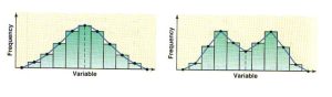
Figure 2.9 (a) A histogram skewed to the right. (b) A histogram skewed to the left.
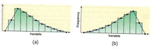
Figure 2.10 A histogram with uniform distribution.
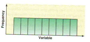
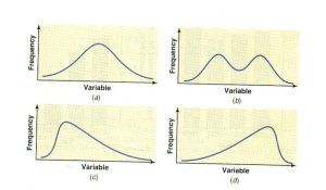
Figure 2.11 (a) and (b) Symmetric frequency curves.(c) Frequency curve skewed to the right.
(d) Frequency curve skewed to the left.