Definition
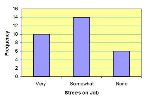
A graph made of bars whose heights represent the frequencies of respective categories is called a bar graph.
Figure 2.1 Bar graph for the frequency distribution of Table 2.4
Graphical Presentation of Qualitative Data cont.
Definition
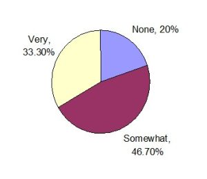
A circle divided into portions that represent the relative frequencies or percentages of a population or a sample belonging to different categories is called a pie chart.
Table 2.6 Calculating Angle Sizes for the Pie Chart
|
Stress on Job |
Relative Frequency |
Angle Size |
|
Very Somewhat None |
.333 .467 .200 |
360(.333) = 119.88 360(.467) = 168.12 360(.200) = 72.00 |
|
Sum = 1.00 |
Sum = 360 |
Figure 2.2 Pie chart for the percentage distribution of Table 2.5.